On Monday, Adidas released their new Reverse Retro jerseys for all 31 teams.
With the announcement of this new line, my personal hope and the hope of some Sharks fans were the usage of the original logo in any capacity. Thankfully Adidas made the right call and paid homage to the pre-2007 look.
Some teams went back to an old logo and paired it with a different color scheme, either with their current colors or a new selection of colors altogether.
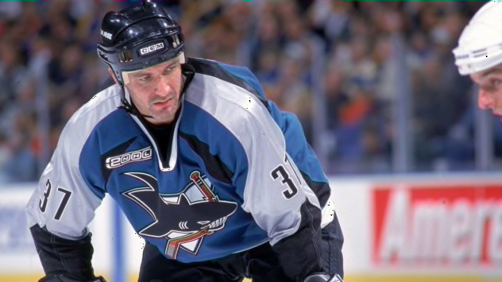
For the Sharks, they opted to use the original colors that existed when the logo was used, as can be seen in the photo below.

They then took this look and converted it into what the new jersey will look like.
First player you think of when you see this jersey: go pic.twitter.com/Aw49923K9y
— San Jose Sharks (@SanJoseSharks) November 16, 2020
The grey used to accent the original jerseys has become the base for the new updated look. Then they utilized the always essential teal to accent the jersey. Then finished it up with a white stripe on the arms and black on the shoulders.
The reactions to the new look by Sharks fans appear to be consistently positive.
https://twitter.com/miguelito10918/status/1328386389747003392?s=20
I CAN NOT WAIT! #Sjsharks https://t.co/E5K7wNny7Z
— Anthony Villanueva (@Villanueva__A) November 16, 2020
https://twitter.com/Kapowski_K/status/1328592112447840256?s=20
When the organization’s fans feel good about it, that definitely bodes well for the jersey’s usage in the future.
In many ways, the look is a breath of fresh air that takes you back to players like Owen Nolan and Evgeni Nabokov.
I do think the Sharks could have been more daring with the usage of the old logo and the coloring to go with it. Frankly, I don’t know what it would be, but something to emphasize the reverse portion of the concept other than slight changes.
However, this is still a perfect jersey that could and should be used for a long time. It oozes the 1990’s in the best way possible.
Many other teams took logos that when they were actually used took a large amount of criticism for. Two in particular that come to mind are the Anaheims Ducks and the Arizona Coyotes.
When the Ducks first unveiled the Wild Wing logo back in 1995, it was deemed one of the worst jerseys in the team’s history. Current younger fans are praising Adidas for the look, while older fans, to my knowledge, have been somewhat silent about the move.
The other that comes up is the Arizona Coyotes’ usage of the Peyote Coyote logo. This look was given the same initial response as the former and was only used for five seasons.
I bring this up because the Sharks brought back a look that was actually popular at the time it was originally being used. Thus giving this Reverse Retro look more shelf life than the Ducks or Coyotes who many believe did the best job.
Ultimately the positives for me include the usage of the old logo and the likeliness of the jersey to stay in use for a long time. But it lacks slightly because they did not take any risks with surrounding design and color.
